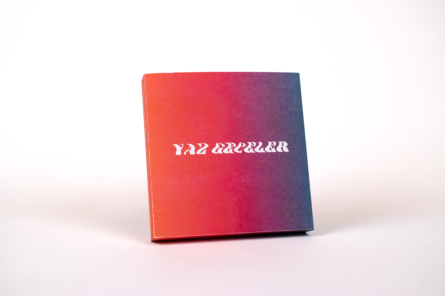
Front of box
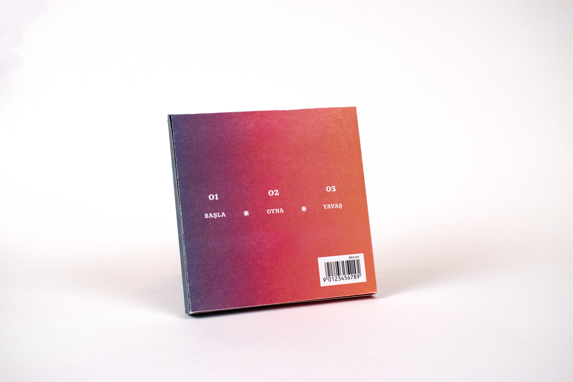
Back of box
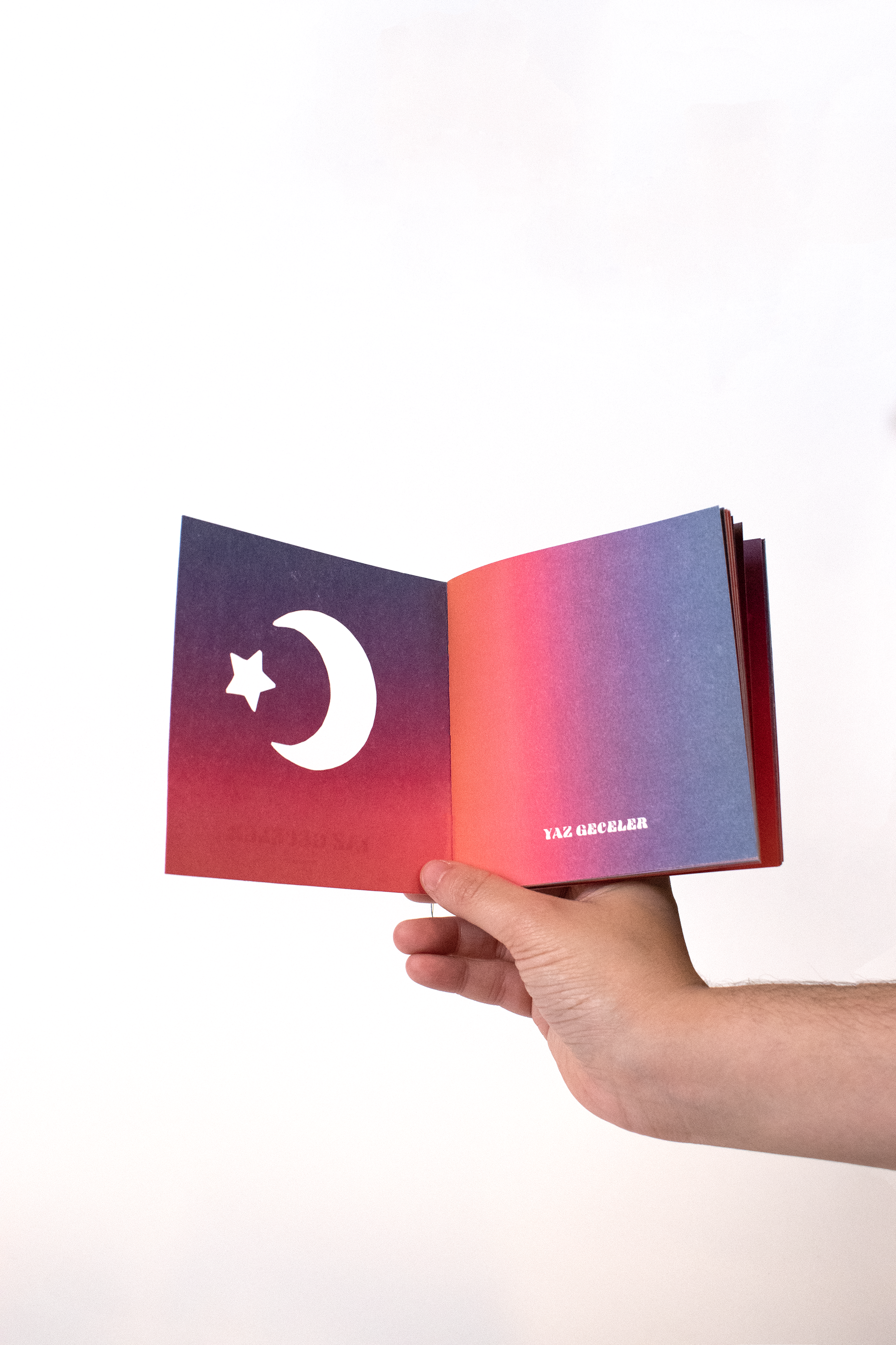
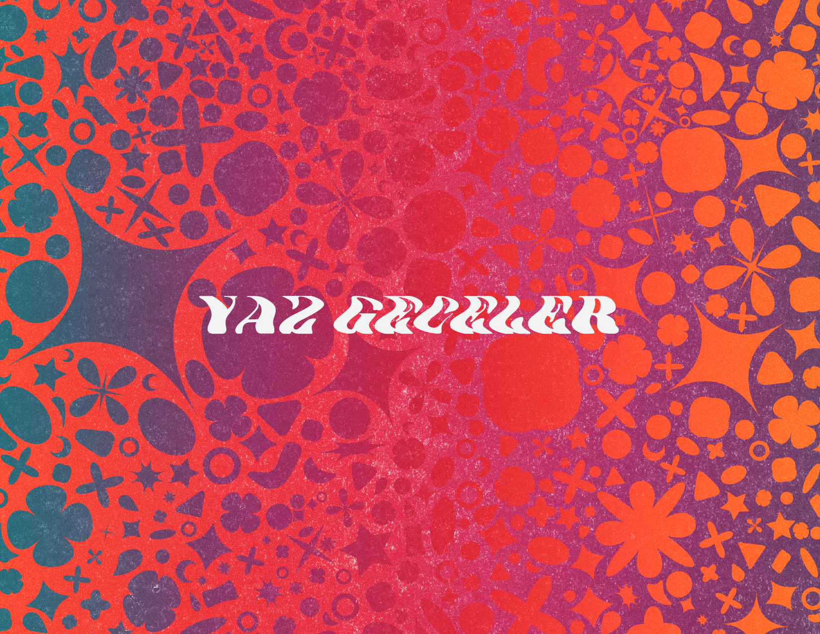
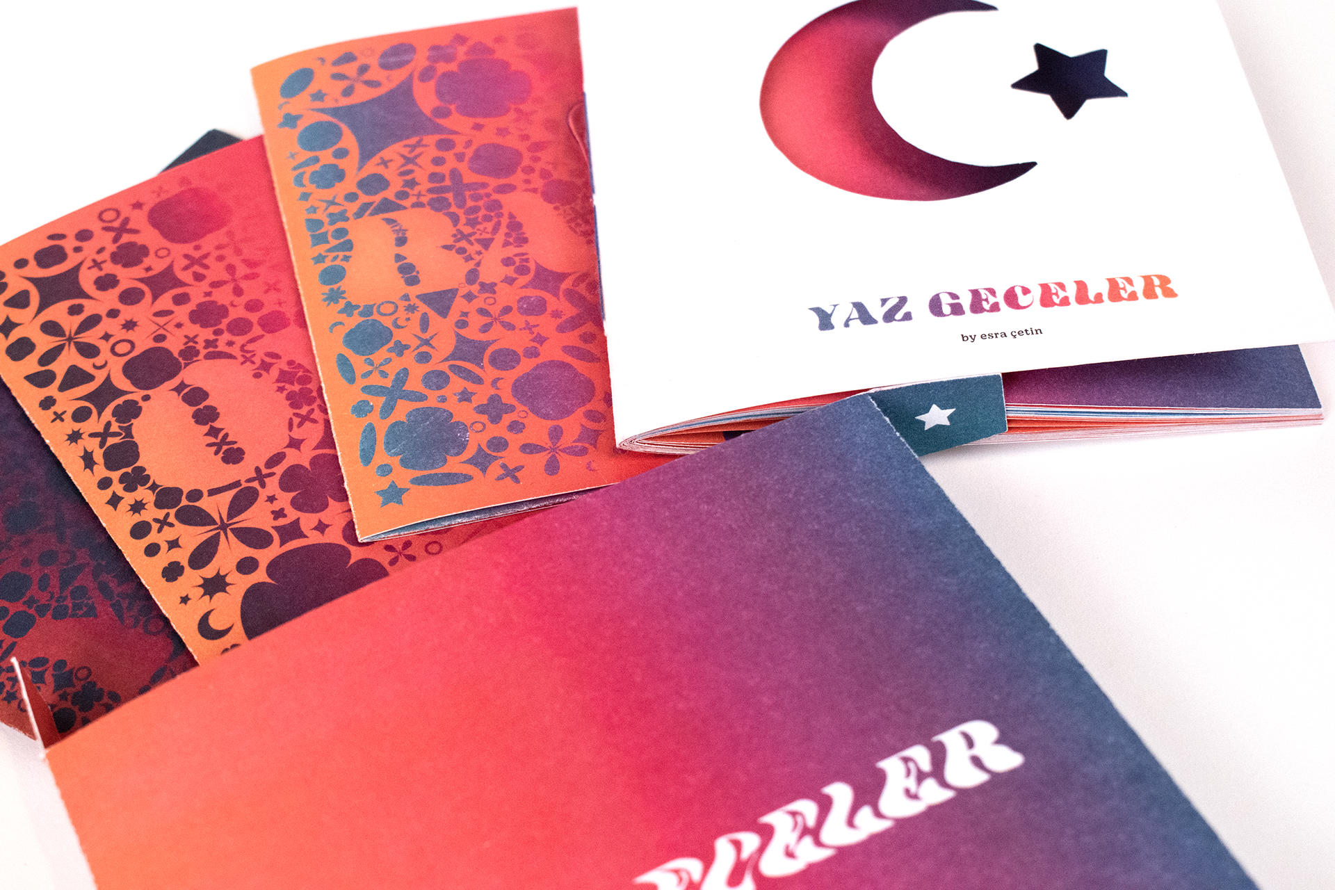
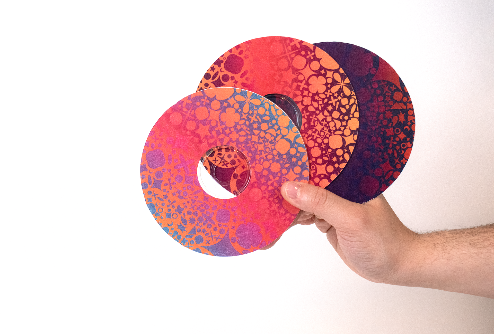
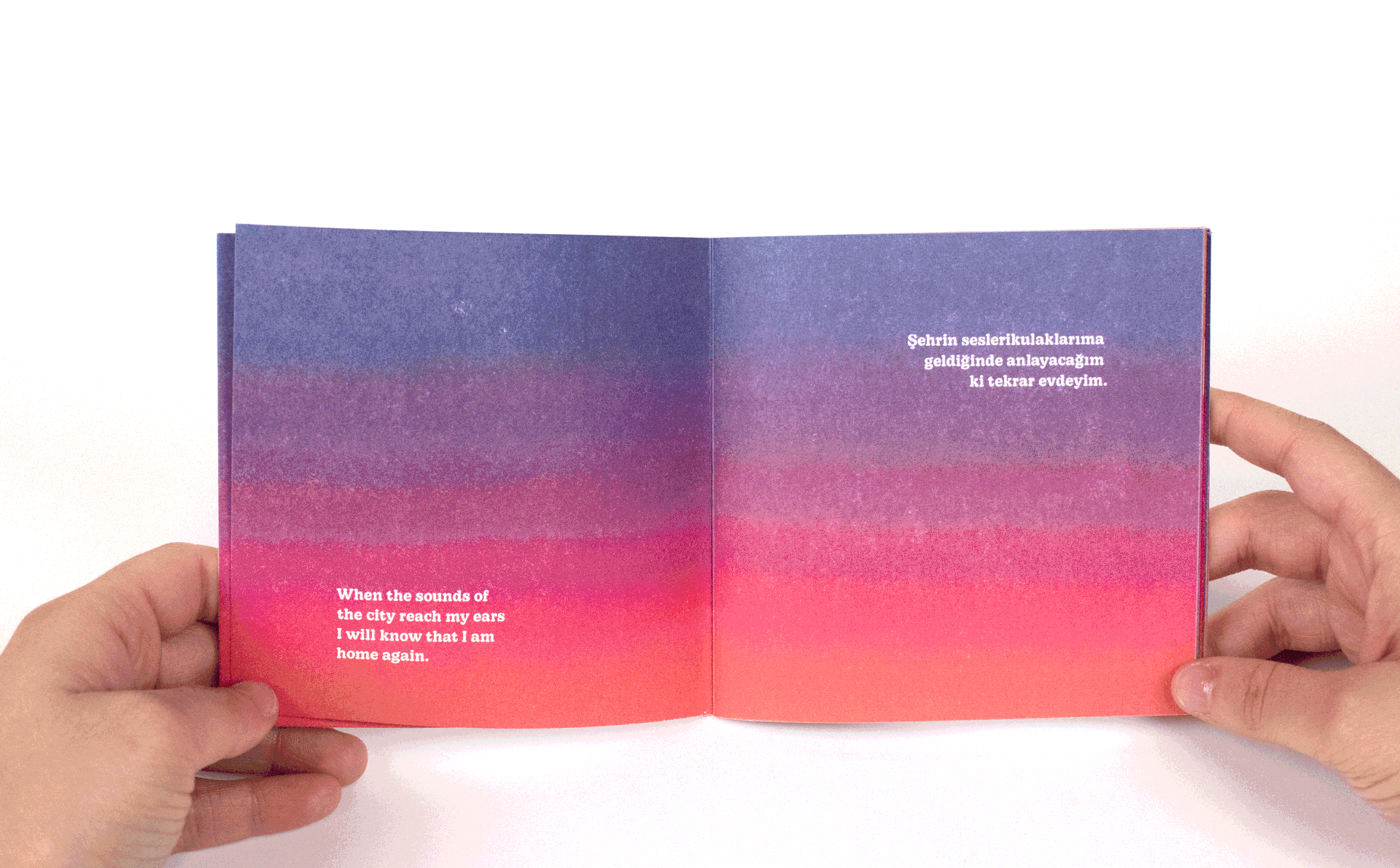
To encapsulate the moody yet upbeat vibe of Turkish Pop, I created a system of gradients that represent the stages of a sunset. I created the gradients on a letterpress machine which allowed for a grittier and organic texture. The resulting prints were scanned in and adjusted to be used as a system throughout the box.
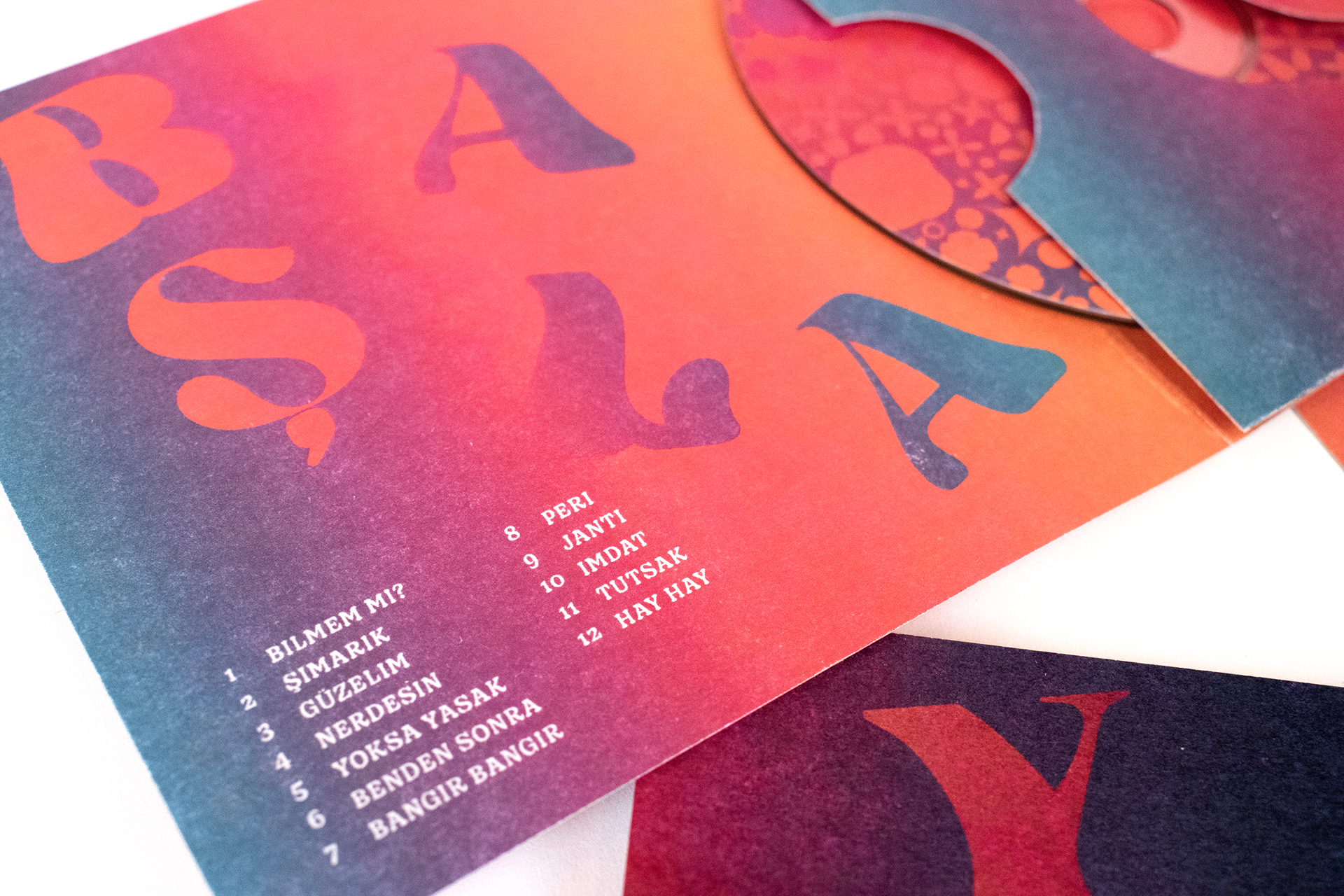
The box itself measures a little over five inches on all sides and features a flap enclosure. Inside, there are three CD sleeves measuring five by five inches and a catalog booklet measuring four by four inches. The album set begins with BAŞLA (start), a playlist catered to getting you into the partying mood. It continues with OYNA (dance) to keep the party going. Finally, the party dies down with YAVAŞ (slow).
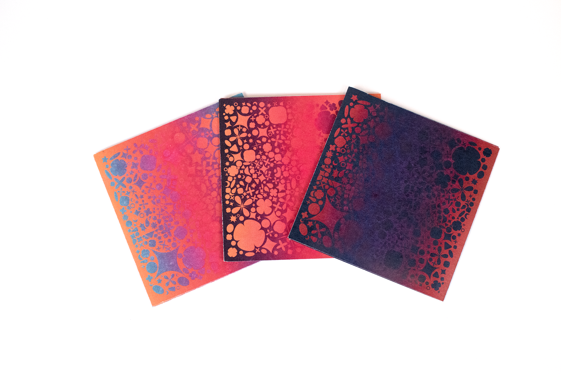
CD sleeve fronts
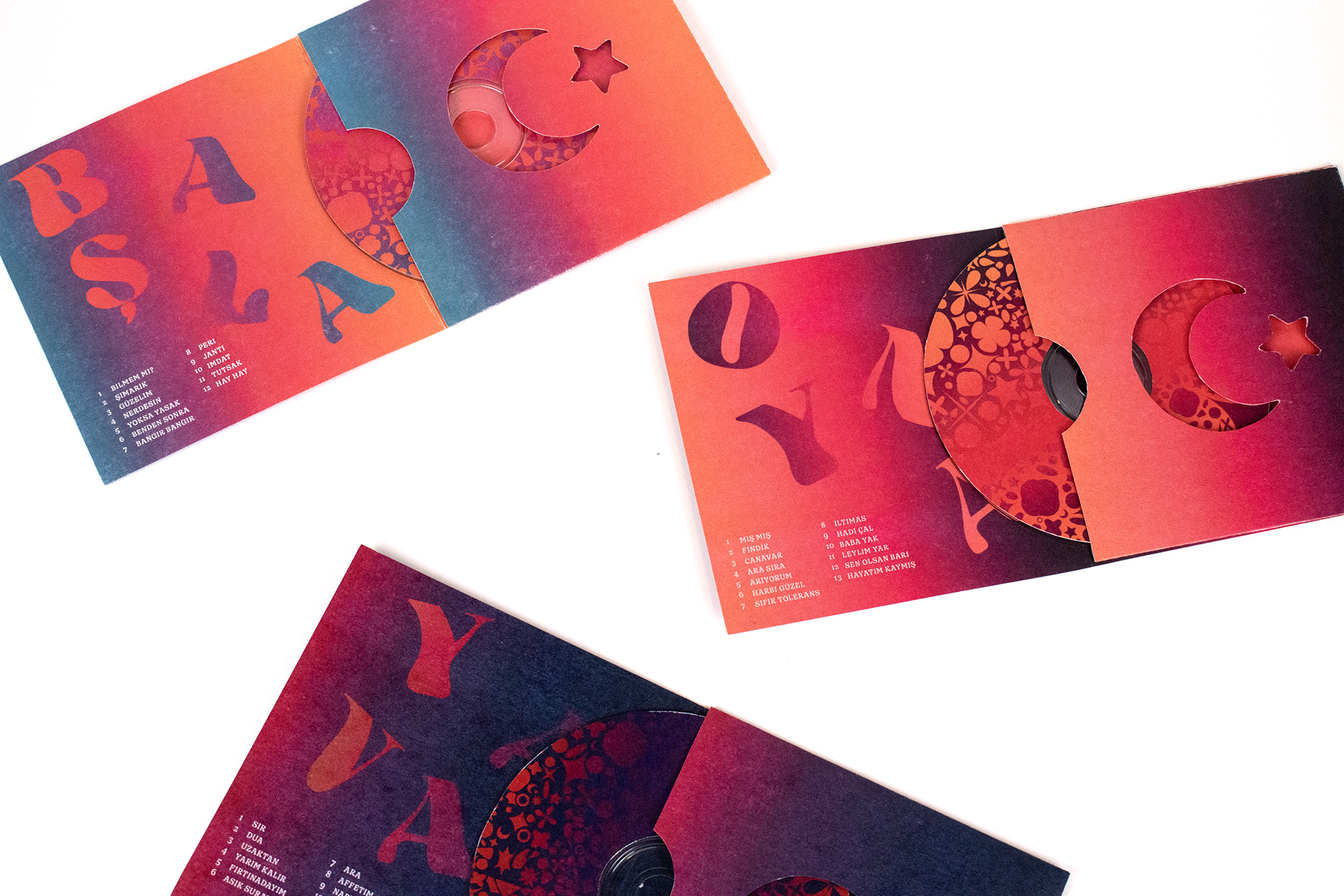
CD sleeve insides
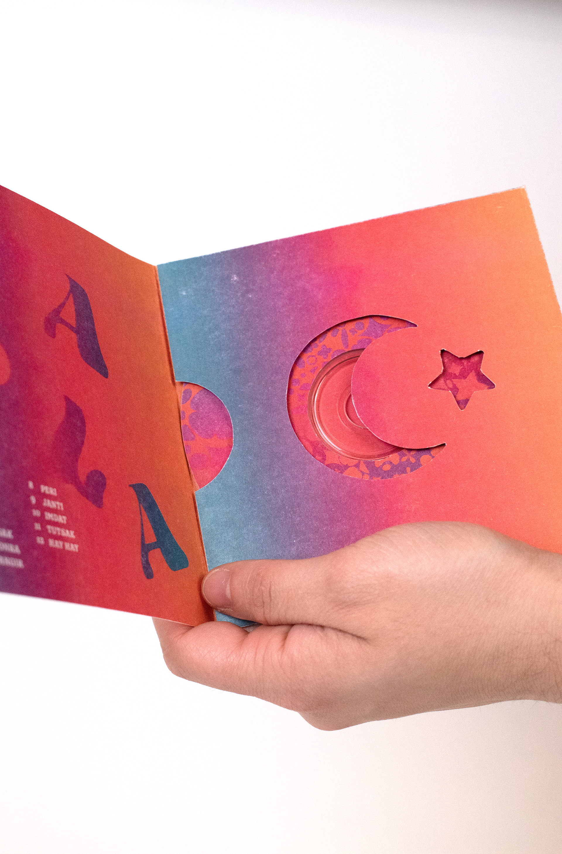
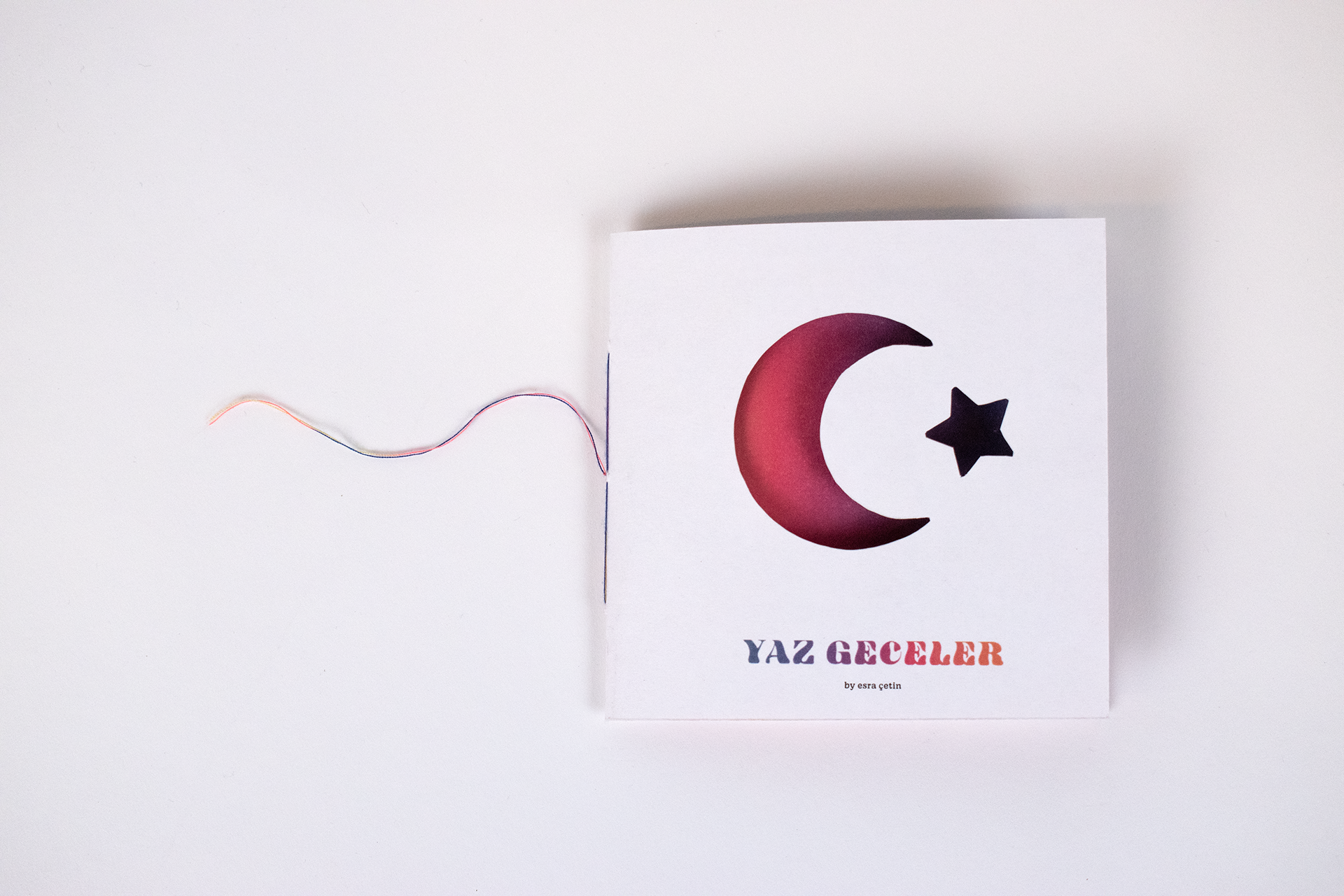
Catalogue booklet cover - hand cut
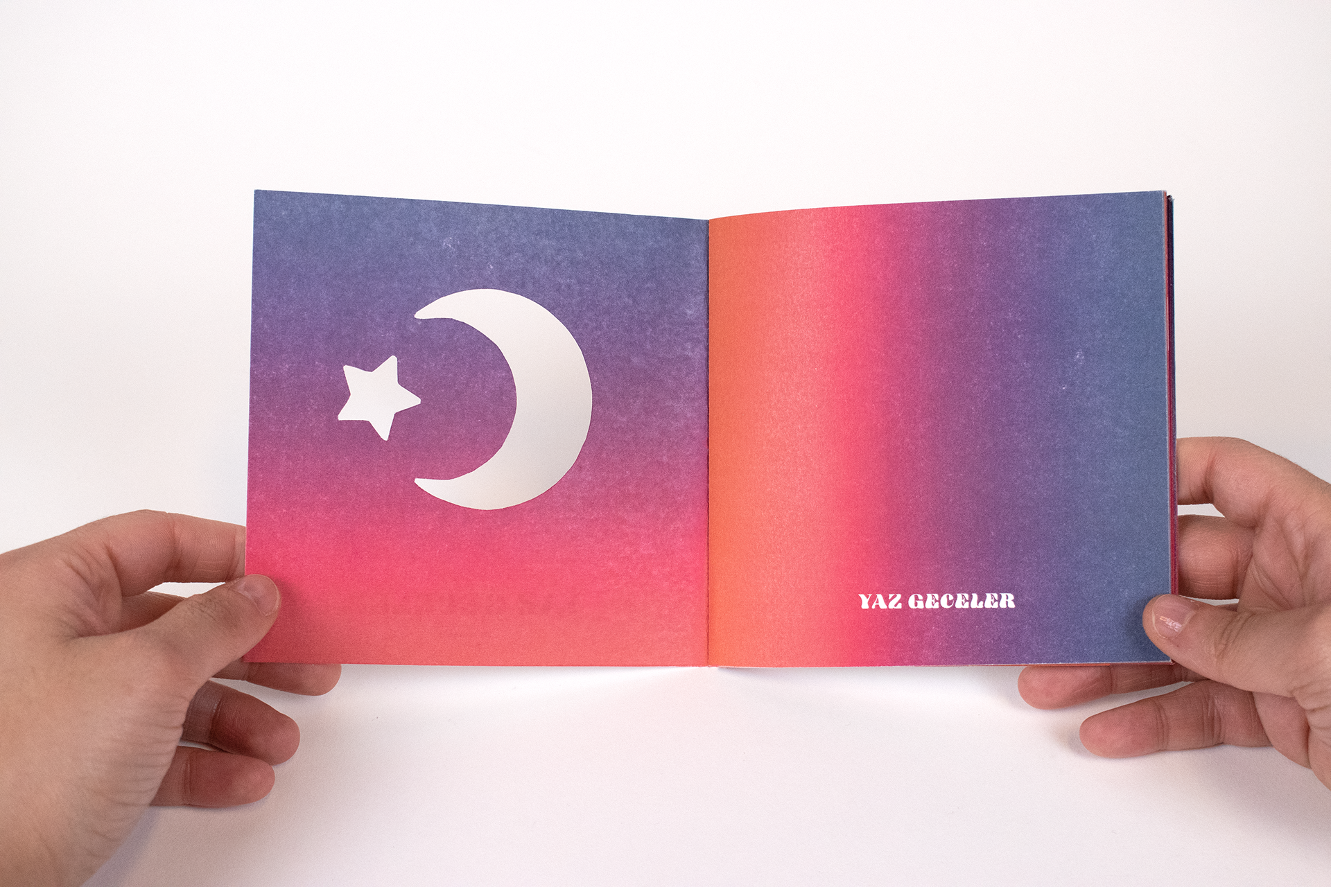
Catalogue booklet inside cover - hand cut
HWT Arabesque, the display typeface, is an Art Nouveau wood type designed by Terry Wüdenbachs. Its quirky and free-flowing letterforms reflect the upbeat energy you’d normally find in Turkish pop. The accompanying typeface, Decoy, holds a softer voice in the project with its rounded terminals, balancing out the higher intensity energy.