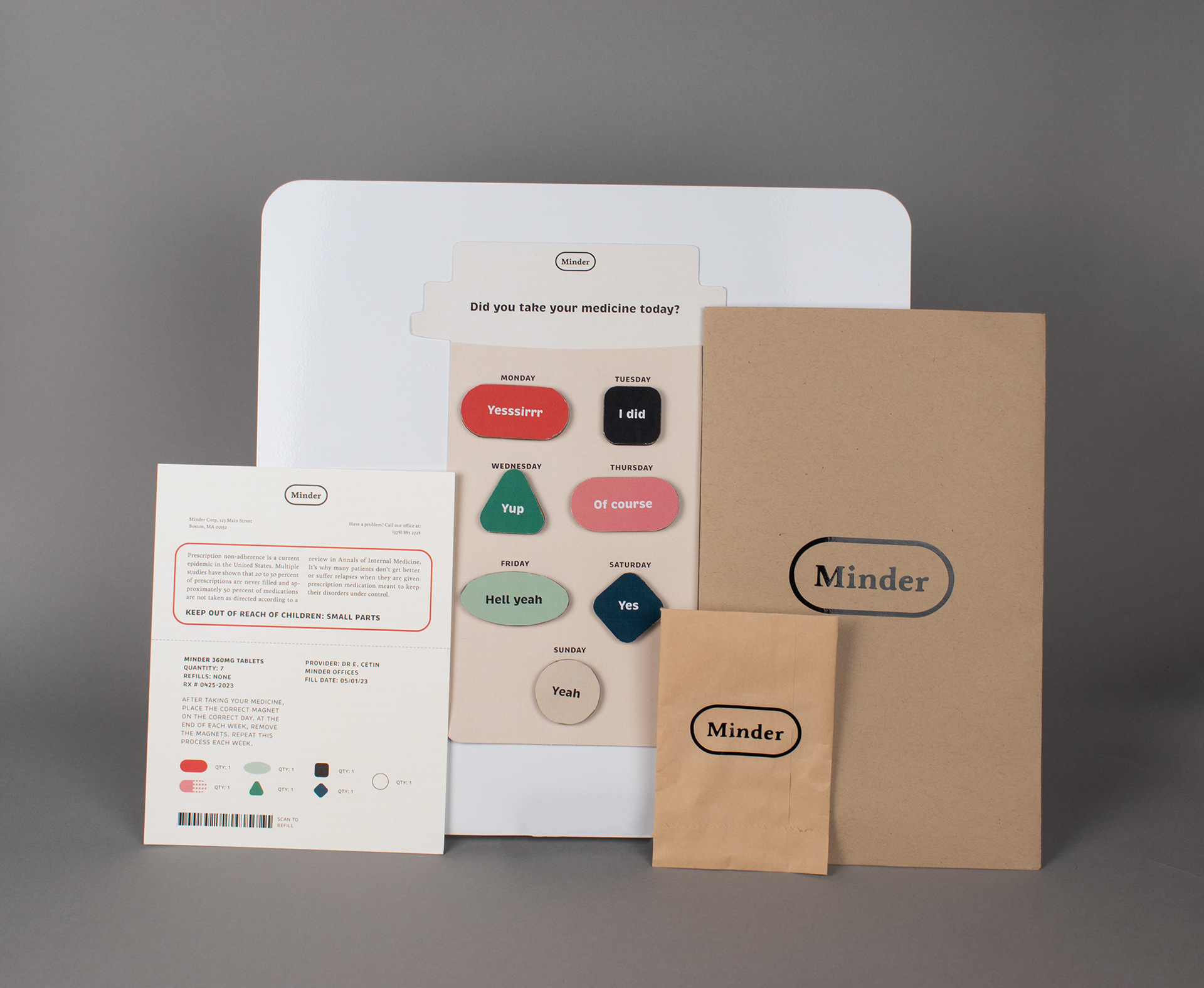
Full Minder system complete with packaging, intervention, and directions.
The brand color palette and icons are based off of existing medications. Some are more tongue-in-cheek, while others are just everyday medications.
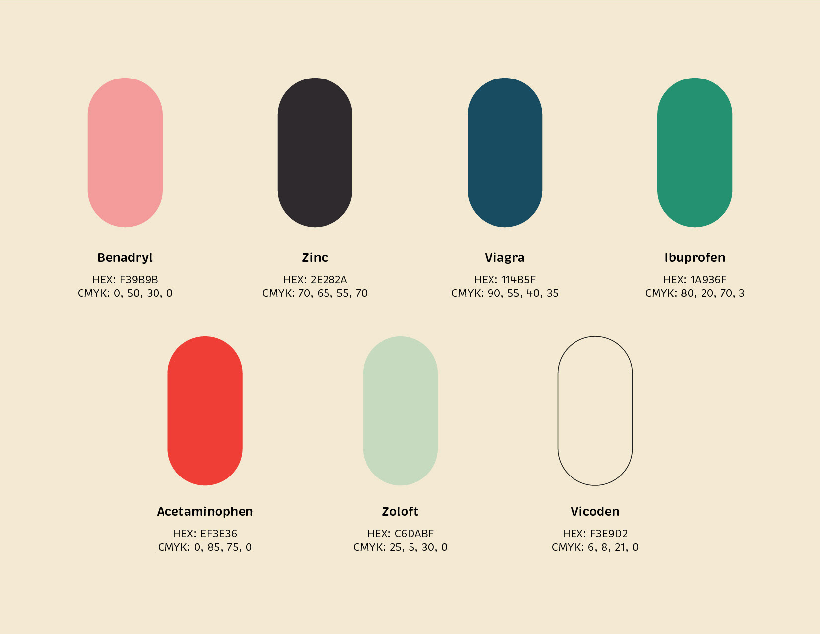
Color Palette
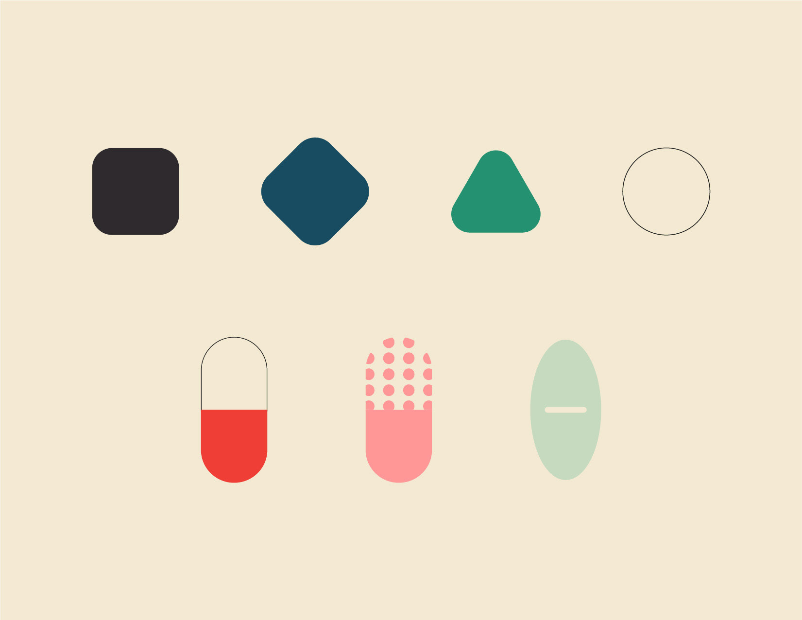
Brand Icons
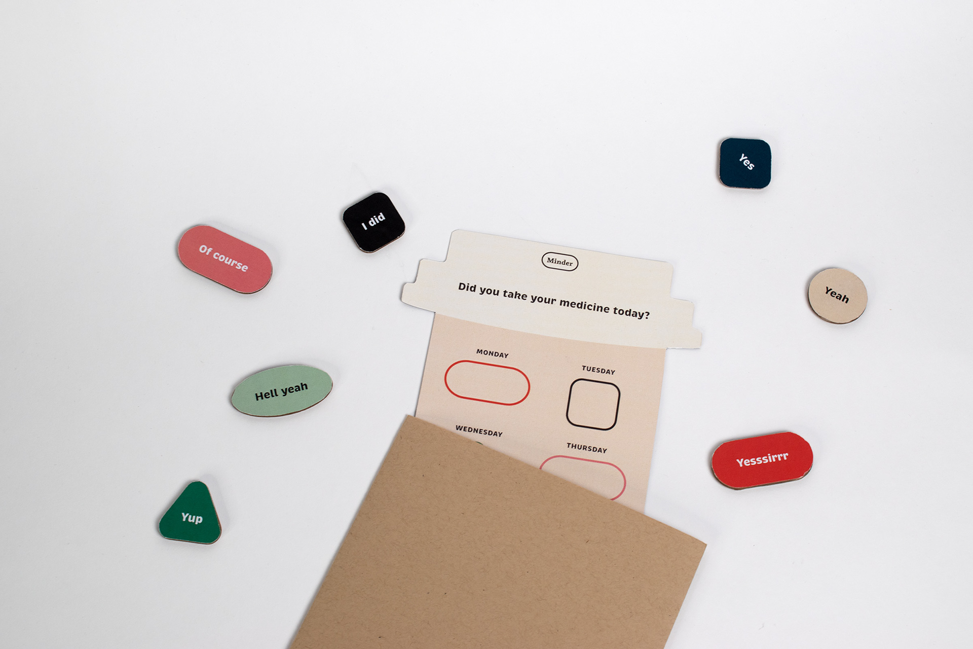
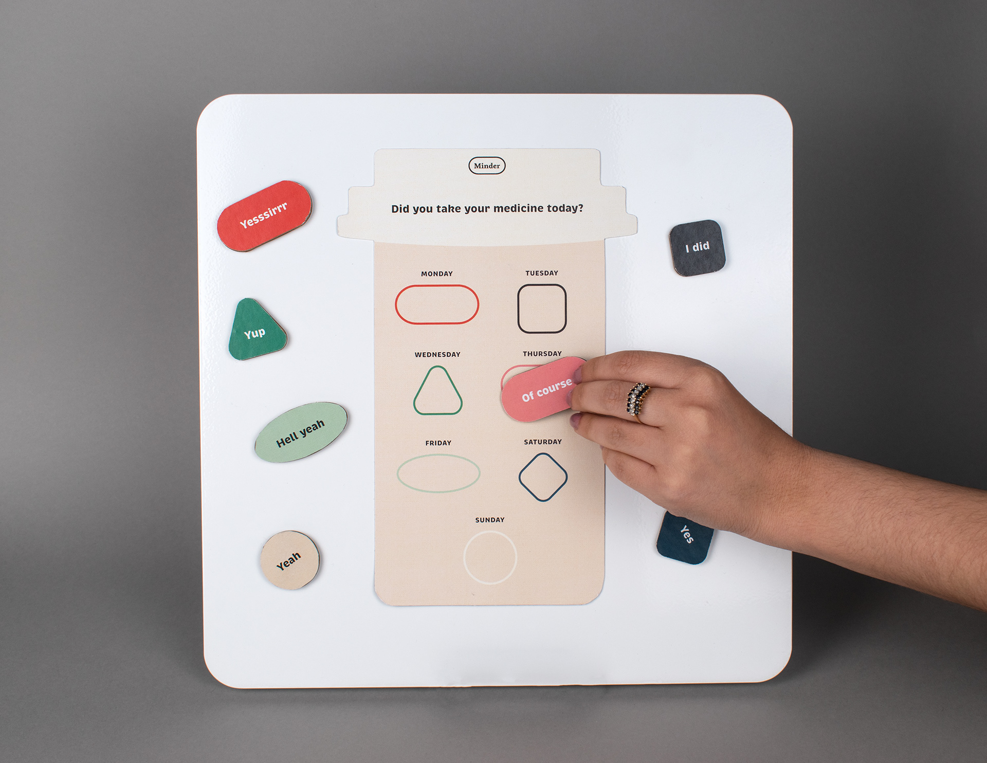
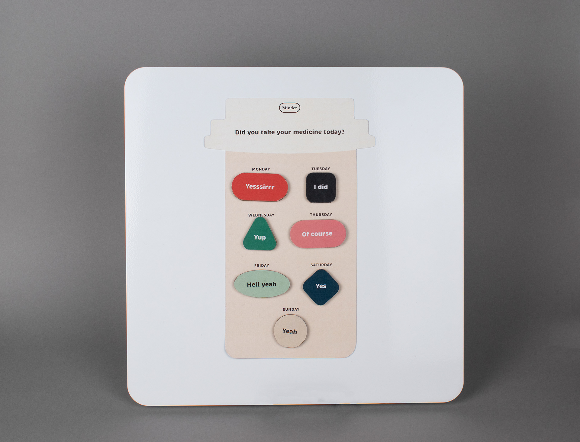
Inspired by pharmacy bags, Minder comes in a paper bag style package adorned with the logo on the front and an instruction guide attached to the back. Inside is the main intervention (the pill bottle) and the pill pack (the magnets). The pill bottle can be placed onto any metal or magnetic surface, such as a fridge.
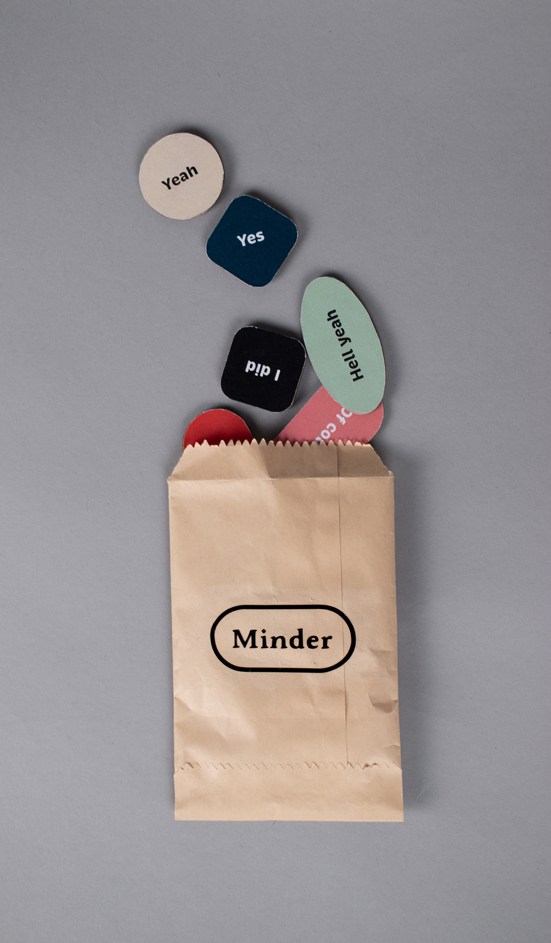
Pill pack magnets
Packaging
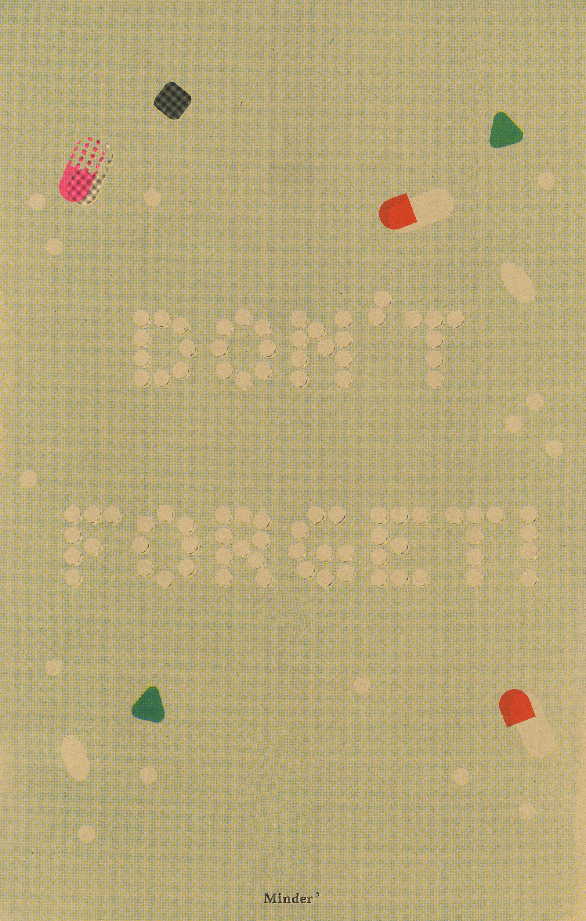
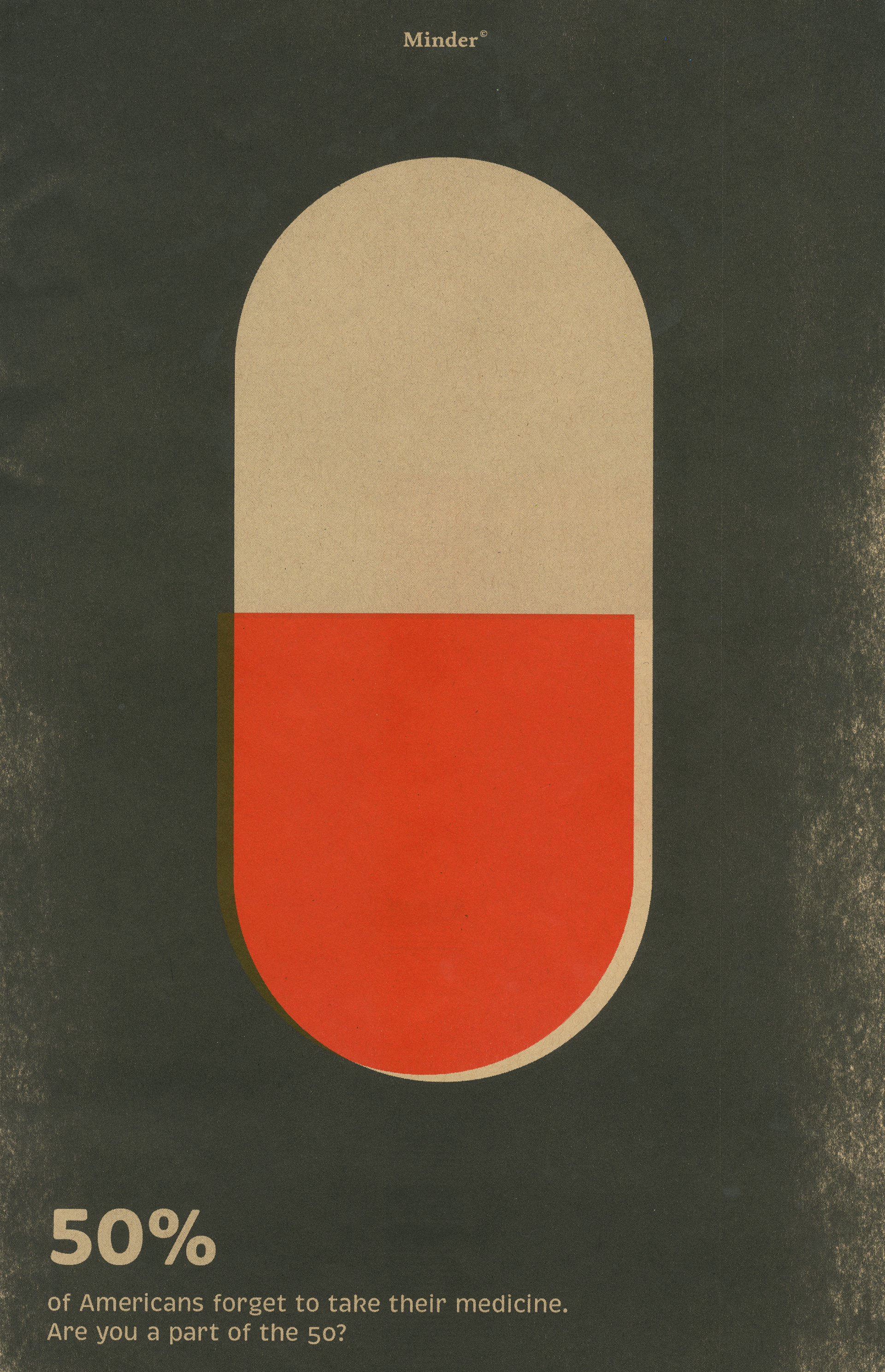
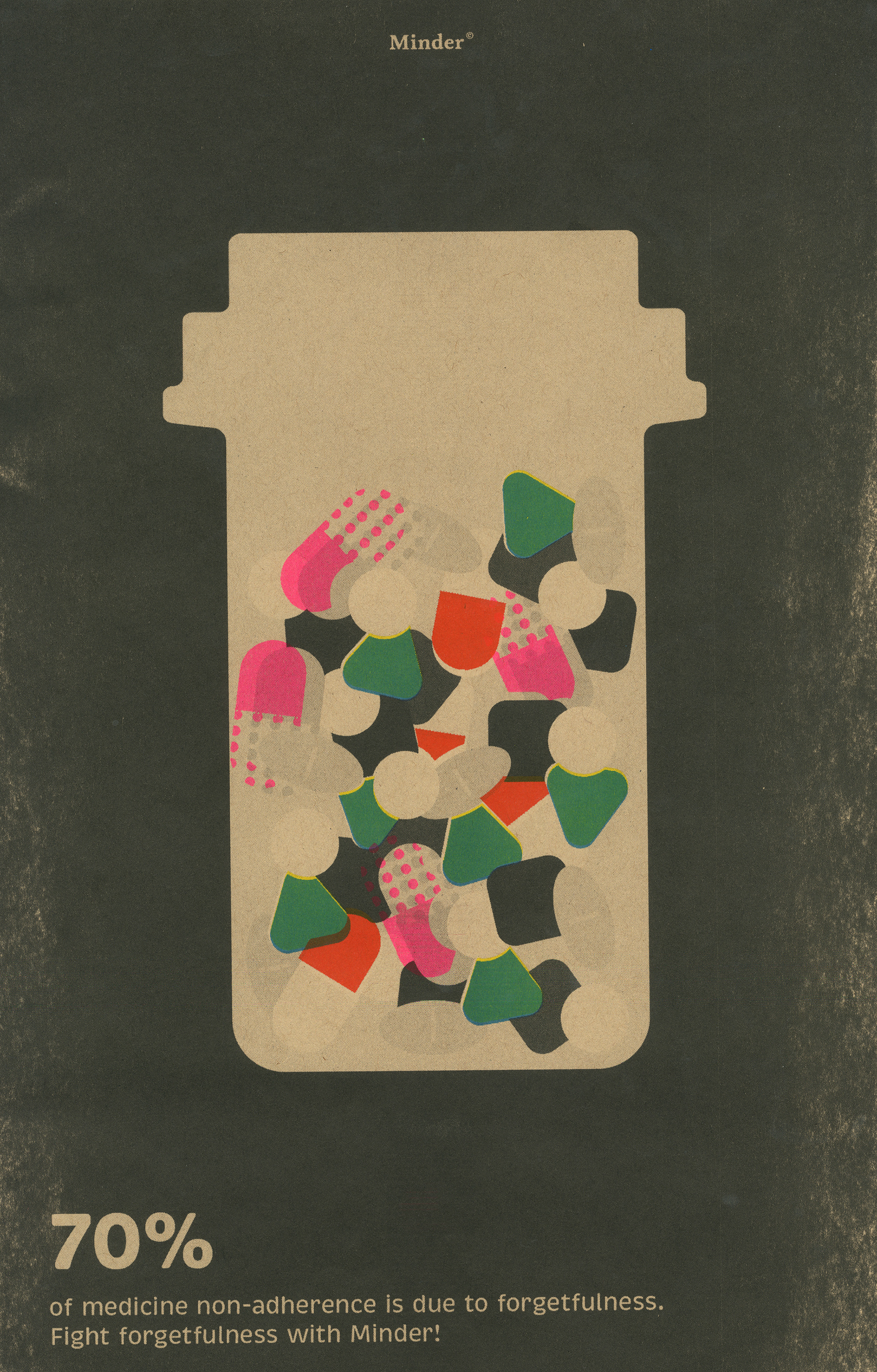
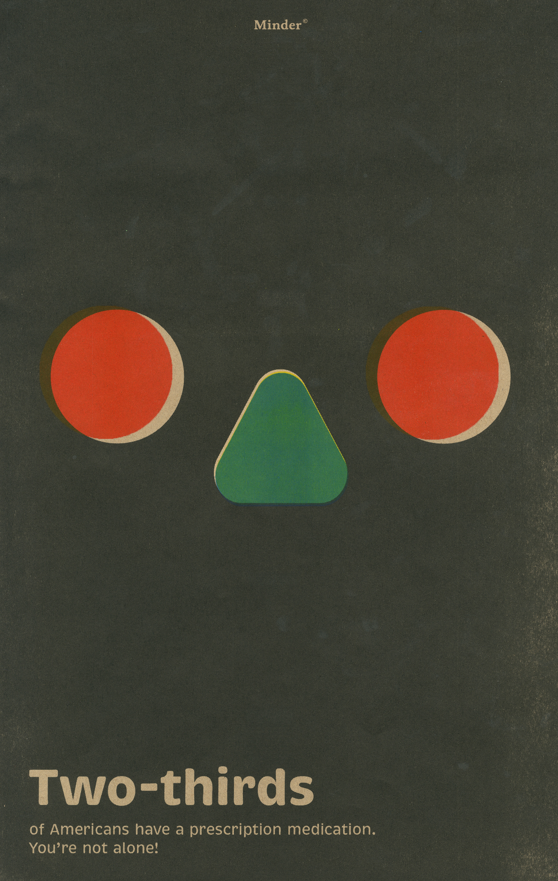
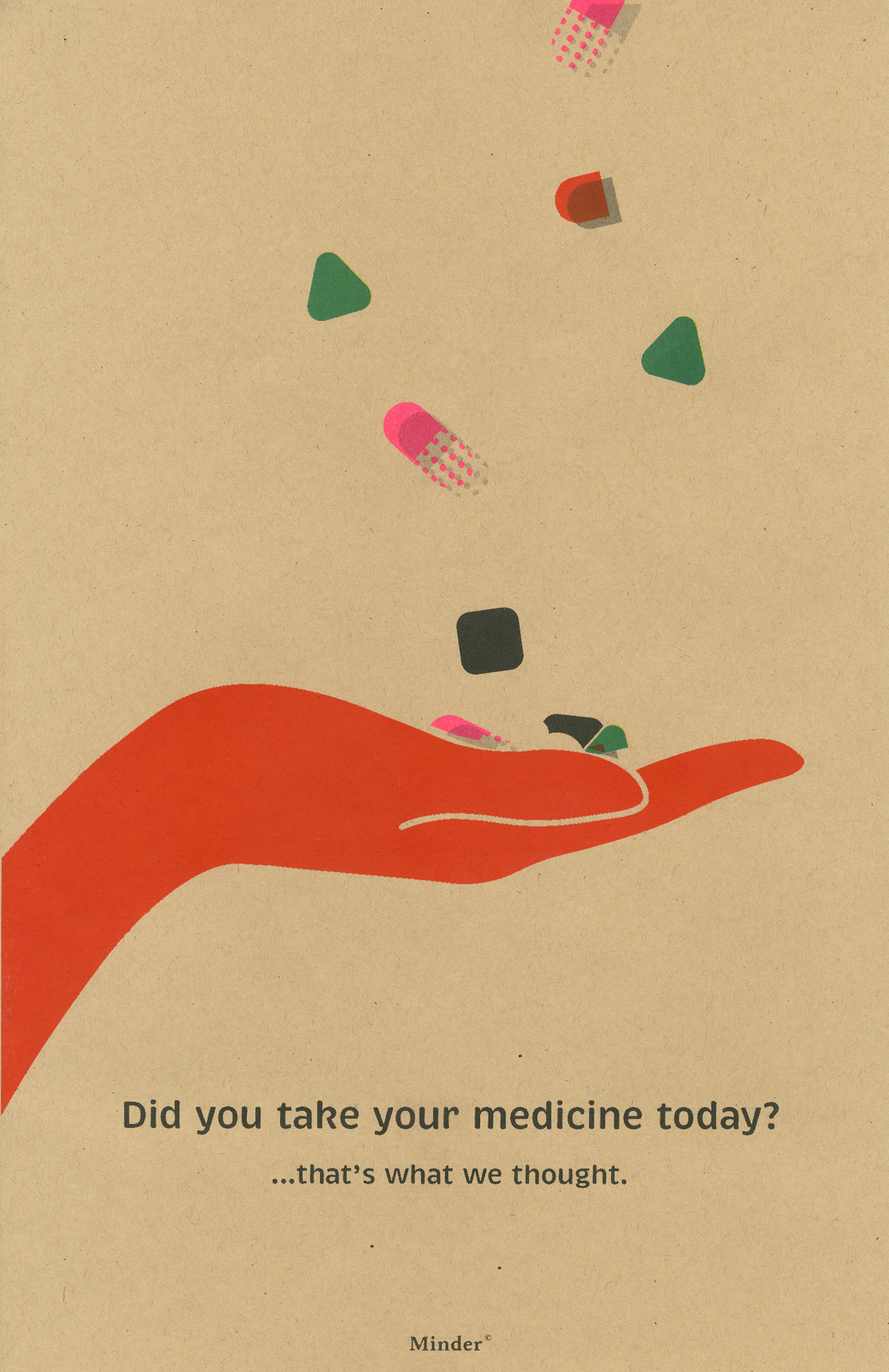
The poster series is intended to be a marketing strategy as well as a fun decorative piece. Utilizing Risograph printing, I was able to get an organic texture and screen-printed look that compliments the main components of the brand but still stands out on its own. The same material used for the main packaging is also used for the posters. While some of the posters are more statistics based, others are more light-hearted.
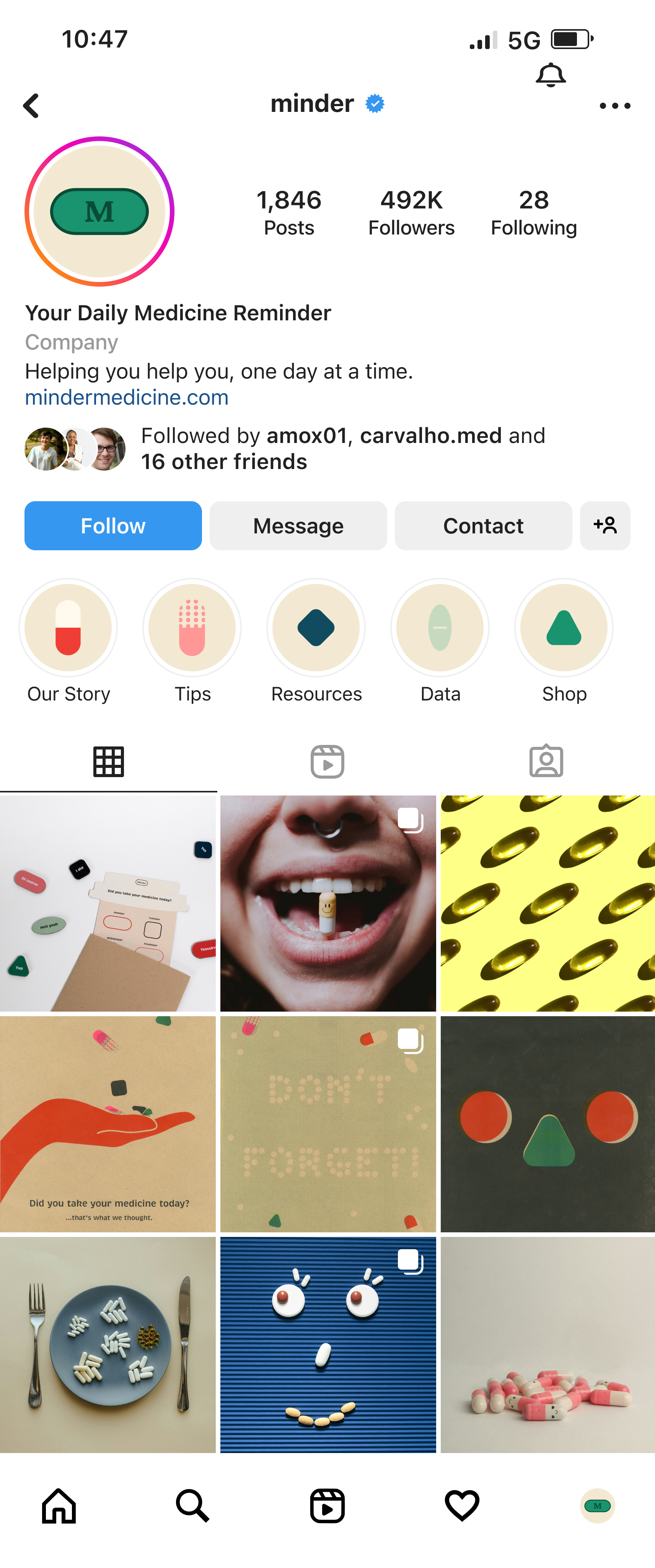
Social media collateral is a key component to this project, as the main goal is to advise and alert its target audience. Posts from the social accounts of Minder follow the same theme as other material—keyed towards a younger audience, fun, tongue-in-cheek, and most of all, informative in a concise but captivating way.
Photos posted must fall within the brand guidelines.